OFF-ON – the question of who first used neon as a medium in art is perhaps not the most important issue. Neon tubes, first used for commercial advertising, have since been appropriated by artists for the representation and material application from the special lighting they emit — a clear break from the natural light celebrated by many plein air artists of the late 19th century — but more importantly, for their association to the shifting values of modernity in urban life and cityscapes.
Visualising the Glow
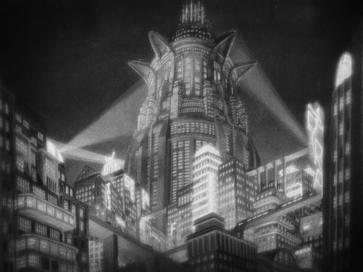
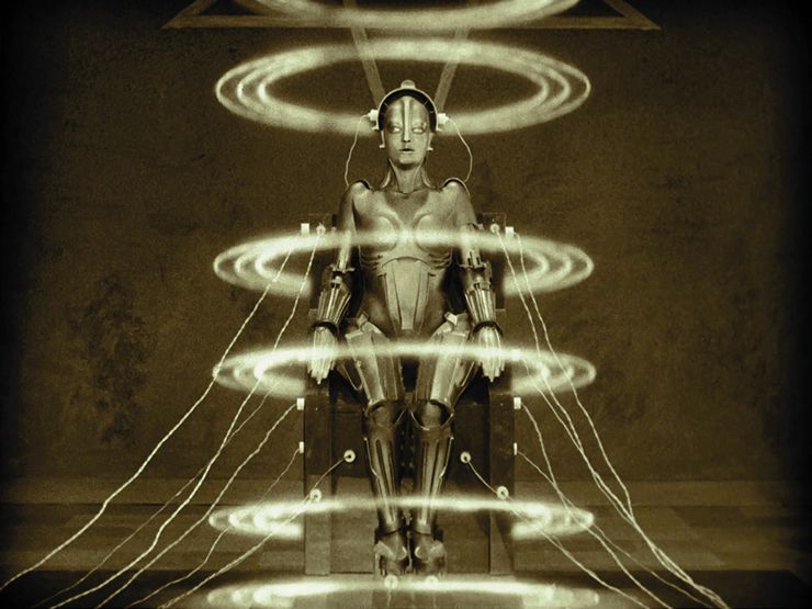
Looking at the various representations of neon signs in the wider field of visual culture, film seems ahead of visual art in embracing the medium for the reproduction of its lighting effects and physical use of neon tubes. This is most evident in Fritz Lang’s Metropolis (1927), using neon in a groundbreaking fashion to evoke a futuristic vision of the city, as well as its use of rising and falling circular neon lights whose diameter corresponds to a female robot’s silhouette in the transformation mise en scène of the gynoid Maria. The neon effects in the urban setting of Metropolis may also have been a response to the neon signs that had become fixtures of cityscapes in 1920s Paris, New York or Shanghai — a sign of growing cosmopolitanism and market economies. But considering the discovery by the film’s main character Freder Fredersen of the city’s underground complex of mechanical structures tended by round-the-clock workers, the appropriation of neon creates the façade of a bustling, technologically advanced city, while probing the effects of industrialisation and the emergence of the capitalist system. Nevertheless, Metropolis seems to establish the ‘neon effect’ as cinematic visual tropes for the artificial, the futuristic or even the prosthetic technological extension of the human body, particularly in sci-fi movies: the first backlit-animated film, Tron (1982), utilised neon glowing characters; the neon-noir Bladerunner enfolded themes of genetic engineering with future moral and philosophical implications of technology on the environment; and in the original Star Wars Episode IV: A New Hope, laser swords are wielded with a light-as-weapon effect. The use of neon in film, like the proliferation of neon lighting in the city, turned night into an artificial brightness, revealing the hidden and concealed, while arresting the gaze with what was dubbed a man-made ‘liquid fire’.
In the realm of visual art, one would think that, of all artists, Edward Hopper — who so effectively portrayed the lost urban American soul before World War II — would be the first to have neon signs represented in his paintings. However, neither of his iconic works Chop Suey (1929) and Nighthawks (1942) has a visible neon sign. Yet the absence of neon in his paintings has been interpreted to emphasise its prevailing use. Although the ‘SUEY’ sign outside the window in Chop Suey is depicted as a sign lit by incandescent bulbs, at this time (1929) exposed bulbs in signage would have represented an obsolete technology — a hint of its disappearance to make way for the neon signs that were already becoming fixtures in the urban landscape of New York and other American cities.
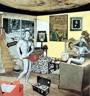
On the other hand, British artist Richard Hamilton’s seminal collage Just What Is It That Makes Today’s Homes So Different, So Appealing? (1956) has the most discreet yet deliberate representation of the prevalence of neon signage: a reproduction of a well-known photograph of the Warner Cinema on Broadway with its numerous flickering neon lights on the opening night of The Jazz Singer in 1927. By having this image in place of a pastoral view through the window, Hamilton situates the apartment interior within a distinct neon-lit and entertainment-filled urban environment. More importantly, the conflation of the interior with the exterior expresses the inevitable influence, or encroachment, of American popular culture — advertising, cinema, entertainment and household appliances — on postwar British consumer culture.
It was in the areas of photography and Photorealism that neon signs became a prevalent subject matter, especially in the United States in the 1960s, when artists such as Richard Estes and Robert Cottingham began depicting America’s everyday in photographic reality using ordinary brushes or airbrushes. Painted using the most meticulous techniques, with a focus on reflections or the effects of light on surfaces such as metal or glass, the appropriation of common urban or suburban iconography or environments in the form of signs, automobiles, shops and streets brought to attention the commonplace reality and the anti-elite subject matter of quotidian surroundings. In his depictions of Americana, Cottingham’s interest in neon signs and his focus on the form and abstraction of neon lettering has been attributed to his brief career in advertising. But it was his understanding of the power, symbolism and contemporaneity of these signs that led him to depict particular iconic signage of American culture from the 1940s and 1950s, most of which have since disappeared. In such works, Cottingham painted only parts of the signs, depicting words such as ‘HOT’, ‘ART’ or ‘ODE’, and later, reducing and reinterpreting the signs even further by painting only the individual letters.
“… it was his understanding of the power, symbolism and contemporaneity of these signs that led him to depict particular iconic signage of American culture from the 1940s and 1950s…”
In the medium of photography, the neon sign has been a great challenge to photographers due to the difficulty of capturing its glowing colour, and sometimes movement. But as a signifier of changing urbanity, at a time when Photography and Visual Art were seen as inhabiting two very different categories, neon was omnipresent in photographers’ work, particularly in the works of a number of significant American photographers. One such photographer is William Eggleston, who depicts scenes of American life in the 1970s and 1980s, bringing to attention the seemingly insignificant or overlooked. Though neon acts more as a kind of backdrop in Eggleston’s oeuvre, his works nevertheless highlight the prominence of neon in American visual culture, essentially establishing the neon sign as synonymous with Americana.
Still moved by the subject, photographers’ fascination with neon signs continues to this day. Martin Stavars’s City of Neon Lights Studies (2013) is an exploration of the forms of neon lights. In this body of work, traditional photographic processes are reversed: in classical black and white photography, dark objects are printed on the photograph, as a reverse from the photo-negative that exposes the dark/light areas and leaves the light things out, whereas in Stavars’s series the lights were burned into the negatives, reversing the photo negative and positive. Such a strategy emphasises the presence of neon lights and their pervasiveness in the urban cityscape.
Materialising Neon
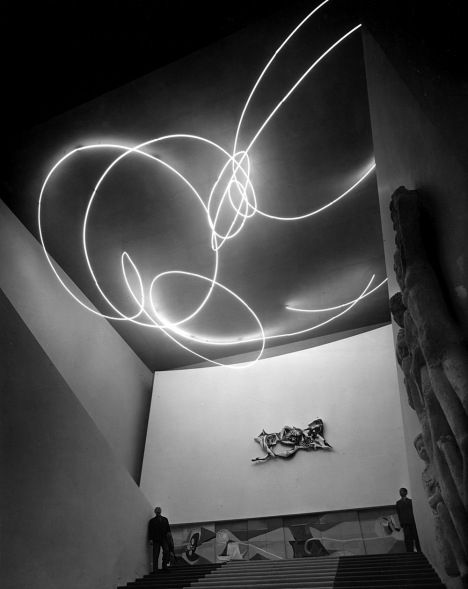
Going beyond the representation of neon, Lucio Fontana pioneered the use of neon as a physical-sculptural medium in artistic practice with Spatial Light – Structure in Neon (1951) for the 9th Milan Triennial— an aerial sculpture suspended from the ceiling of the central staircase of the Palazzo dell’Arte, the Milan Triennial building. Made of a nearly 200-metre-long length of thin white neon tubing, the piece was shaped to curl and loop in an organic, free-flowing manner. Designed in collaboration with architects Luciano Baldessari and Marcello Grisotti, Spatial Light was a manifestation of what Fontana called a ‘spatial environment’ and a ‘spatial concept’, overcoming division in architecture, painting and sculpture by converging colour, movement and space. While the piece was preceded by Black Environment (1949) — which comprised organically shaped papier-mâché forms hung from the top of a darkened ultraviolet-lit room to create an immersive experience of glowing luminous forms hovering above visitors’ heads — neon tube was a deliberate choice of material for Spatial Light as part of Fontana’s explorations into the ‘aesthetics of the man on the street’. The rare neon white glow of this piece, akin to that of fluorescent lighting — which became popular during World War II after the beginning of its mass production by General Electric — further highlights Fontana’s appropriation of commercially available material as a means to conflate the artistic with the mundane. More importantly, it was neon’s seeming immateriality that was equivalent to what Fontana aspired to produce: ‘neither painting, nor sculpture’ but a ‘luminous shape in space — emotive freedom for the spectator’.Fontana’s work launched a new visual language that was to become an integral part of contemporary art, opening up the way for subsequent artists to use neon. This was particularly so in 1960s New York, where artists met that were part of Pop Art, Fluxus, Nouveau Réalisme and other art movements. Neon’s industrial, ready-made quality, coupled with its being a product of a distinctly changing urban environment, presented it as a key medium for artistic practice.
“… it was neon’s seeming immateriality that was equivalent to what Fontana aspired to produce: ‘neither painting, nor sculpture’ but a ‘luminous shape in space — emotive freedom for the spectator’. Fontana’s work launched a new visual language that was to become an integral part of contemporary art, opening up the way for subsequent artists to use neon.”
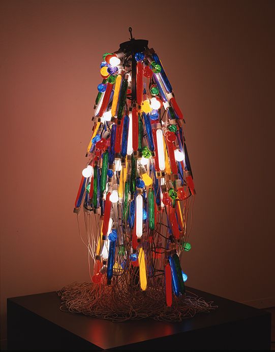
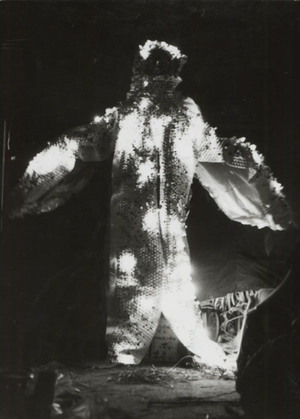
Atsuko Tanaka’s Electric Dress (1956, reconstructed in 1986) — a wearable sculptural piece comprised of short neon tubes and light bulbs — is an earlier example of an interconnected artistic movement between Japan, Europe and the United States. Inspired by a pharmaceutical advertisement illuminated by neon signs, the work probes connections between technology and human physiology. In wearing the dress to exhibition openings, Tanaka’s use of neon straddled the boundaries between sculpture and performance. Specifically, the piece explored the time-based qualities of neon, including its smovement, the gestures that reflect Tanaka’s involvement with the Gutai group, and her interpretation of Gutai’s interests in the everyday, materiality and embodiment. Tanaka’s explorations of the body would be further developed in a series of garments such as Stage Clothes (1957). Electric Dress nevertheless remains an iconic work of the postwar anti-art oeuvre in Japan. With the dress’s silhouette reminiscent of a Japanese kimono, and its linear strands of multicoloured lights evoking the nerves and muscles of the human body, the piece also depicted neon as a technological extension of the body — notions not too dissimilar to the cyborgs and robots that featured in sci-fi films.
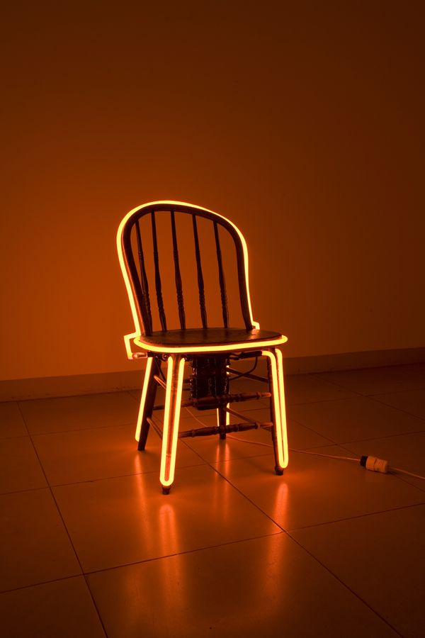
In 1962 — a magical year in art that saw the presentation of a number of seminal works, including Andy Warhol’s first exhibition in New York and the founding of Fluxus in Germany — American artist Robert Watt produced Chair, which became a key example of the sculptural use of neon tubing. Perhaps indicative of Watt’s relationship with George Brecht, whom Watts met for weekly lunch meetings over a number of years, Chair acts as a reference to Brecht’s recurrent use of chairs as ready-made objects. Such a gesture of referentiality or quotation would later be developed in another body of Watt’s neon works in which Watt appropriated the signatures of historic artists such as Manet, Goya, Matisse and Rembrandt — all considered masters of light. Each signature was written in a colour associated with its respective artist — for example, Goya in golden yellow and Ingres in a deep red — highlighting the issue of branding and iconicity in art history and cultural production. Watt’s explorations are embodied by neon, capitalising on neon’s ability to speak to both the mass-produced and the unique, and its ability to produce a literal and spatial aura.
The sculptural use of neon by the painter James Rosenquist, in one of his few sculptures Tumbleweed (1963‒66), attests to the sensuality of neon as an artistic medium. A tangle of chromed barbed wire around three crossed wooden beams, threaded with glowing blue neon tubing, Tumbleweed expresses the Surrealist implications of Rosenquist’s work in the form of its unanticipated tactility — raw, sharp and spiky — suggesting a military blockade to capture the tense political climate of the early 1960s.
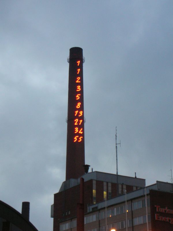
Tumbleweed was a predecessor to Mario Merz’s abundant use of neon in his sculptures, including Giap’s Igloo (1968) — the first in his seminal series of dome-shaped, neon-studded igloos made of earth, metal, twig and neon which features a quote, in neon-tube lettering, from North Vietnamese General Vo Nguyen Giap: If the enemy masses his forces, he loses ground. If he scatters, he loses force. Such combined use of the organic and the artificial, the light and the heavy, coupled with the use of the igloo as an archetypal form of human dwelling, symbolised multiple meanings of opposition to consumer capitalism amid the political turbulence of 1968, as well as the constantly changing, nomadic identity of modern man. Later, in works exhibited alongside those of other members of the Italian Arte Povera movement, Merz installed Fibonacci numbers (a sequence of numbers in which each numeral is equal to the sum of the two that precede it, as in 0, 1, 1, 2, 3, 5, 8, etc.) in neon form around a spire to represent the universal principles of creation and growth.
Around the same time, Martial Raysse would incorporate neon into his paintings, signaling his alignment with the 1960s Nouveau Réalisme movement, which aimed to redefine the ‘real’ with a focus on the humanistic and everyday as opposed to the figurative or abstract. Clinical dissections act as a key gesture for Raysse as he attempts to find beauty in the ‘neutral’ as dictated by the mass produced, thus deploying neon as a smooth, uniform, industrial material. The outlining of specific contours in his portraits is a recurrent gesture that is rooted in Raysse’s desire to draw out the physical alterations that he makes to the found images that he employs as subject matter — part of the artist’s search for the ‘real’.
In America, Robert Rauschenberg’s Green Shirt — a monumental arrangement of images that reference both high art and the commonplace, rendered in multicoloured neon lights — was commissioned for the United States Pavilion at Expo ’67 in Montreal. The presence of a neon-based work of art in the US Pavilion is indicative of the significance of the neon medium in the contemporary art world of the late 1960s. The piece was part of Rauschenberg’s ongoing attempts to reinterpret painting as well as his explorations into the ‘real’ versus its abstractions. The combination of fragmented images reflects the artist’s attraction to collage, in which the focus is placed on the seams and boundaries between images. In this case, neon’s ability to speak to the common and the commercial, and therefore to ‘low art’, is used to bridge the gap between the everyday and the transcendent.

The artists who are perhaps best known for their use of neon are Dan Flavin and Bruce Nauman. While the word ‘neon’ is often used to describe Flavin’s work, beginning in the early 1960s when he first brought ‘neon’ into art galleries, Flavin was actually using fluorescent light tubes but with the colours and lighting effect of neon, to bring out the commercially available medium’s expressive possibilities. But while Flavin used neon-like fluorescent tubes to expand the wall painting into a light installation, immersing audiences in the aura of physical light, Nauman used neon as part of his inquiry into the parameters of art and the role of the artist. Nauman’s piece The True Artist Helps the World by Revealing Mystic Truths (1967) was fabricated by neon technicians under Nauman’s supervision, like many of his other neon pieces, and is suggestive of an affinity for industrial materials that serves to challenge the role of the artist as well as the frameworks and methodologies that constitute cultural production — notions characteristic of the anti-art sentiments of the 1960s. Nauman’s text in The True Artist (the text and the full title of the piece are one and the same) is a tautologically self-reflexive poetic fragment: an example of the artist’s playful explorations of language, as informed by the philosopher Ludwig Wittgenstein, as well as an interpretation of the rhetoric of advertising. The piece nevertheless acts as much as an object as it does text and image — another quality that neon offers as a medium — and thus also becomes an exploration into the affect and corporeality of visual consumption.
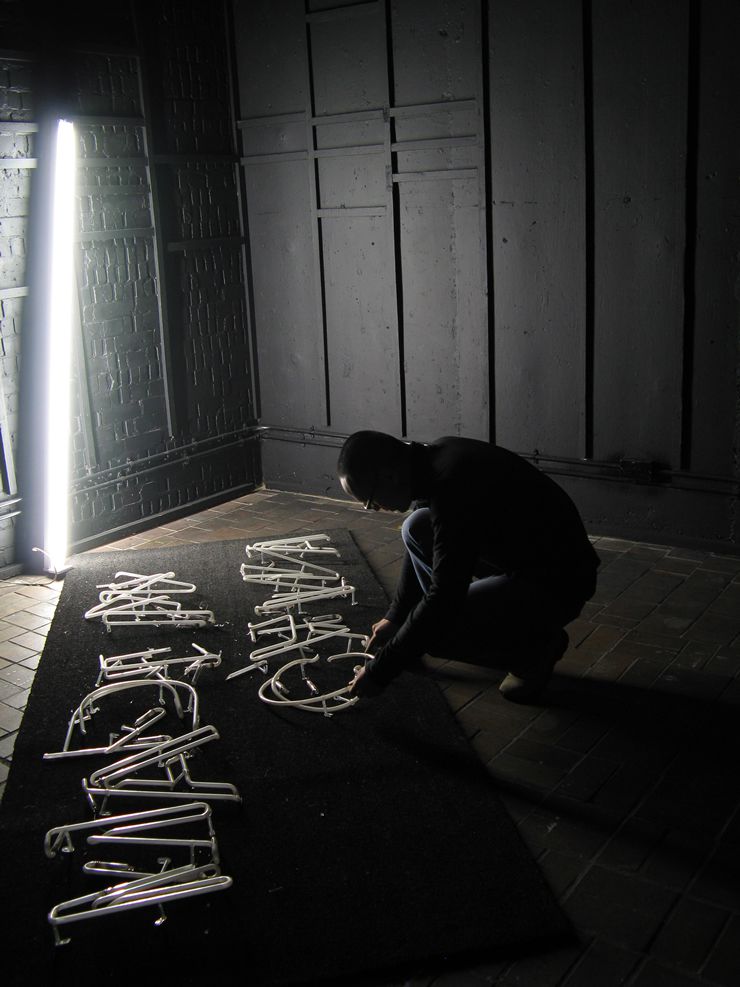
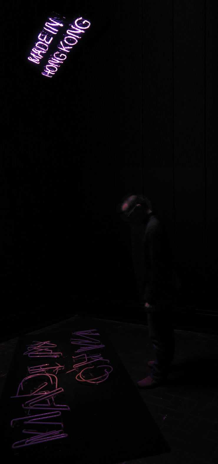
In Hong Kong, a city almost defined by the glare of its uber-neonscape (or neon-lightscape), neon continues to be a popular medium for artists today. Lam Tung Pang’s Shaking China (2008), for example, has been acquired as part of the M+ permanent collection. Consisting of a juxtaposition of three neon signs reading ‘Made in UK’, ‘Made in China’ and ‘Made in Hong Kong’, the size of each sign corresponds to the manufacturing costs of the signs in the three respective locations. In this way, the industrial qualities of neon are addressed, in connection with the implications of mass-market economies. The fragility of neon, however, is an aspect that the piece unintentionally comments on — the ‘Made in China’ sign was broken while the piece was in transit, giving an ironically literal meaning to Shaking China, while also attesting to the difficulty in handling neon and the immense anxiety that comes with the use of the material.
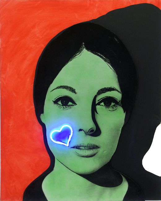
Since the 1950s, neon has been a prominent feature in many art forms. Its prevalence has been indicative of artists’ interests in considering and representing contemporary everyday life, as neon has been an integral part of the vernacular fabric of the commercial, the contemporary and the urban. But the medium has continued to take on more expanded and elusive meanings as artists such as Joseph Kosuth and Tracey Emin incorporate it into their works, playing not only with neon as a medium but also exploring an immediate psychological relationship between words, form and the material, transporting neon into the realm of emotively loaded objects on display, away from the urban setting from whence it began.
 Film still of Metropolis (1927); Image courtesy Eureka Entertainment Ltd.
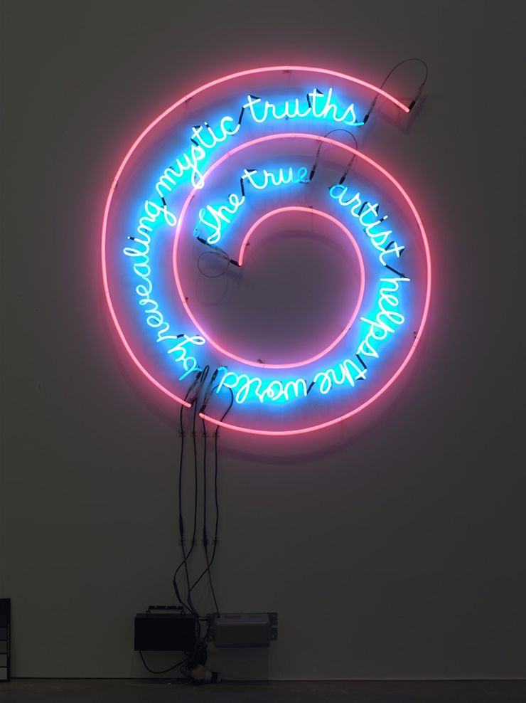 Bruce Nauman, The True Artist Helps the World by Revealing Mystic Truths, 1967; © Bruce Nauman / Artists Rights Society (ARS), New York